artz@artz · October 17, 2026 · 0 views
Selective Focus Editorial Portrait: Magazine Photography with Asymmetric Composition
[Series Name]: [Series Name]
[Main Title]: [Main Title]
[Subject]: [Subject]
[Name]: [Name]
[Role]: [Role]
[Key Line]: [Key Line]
[Accent Color]: [Accent Color]
[Focus Method]: [Focus Method]
[Aspect Ratio]: 9:16

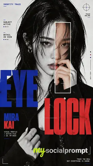
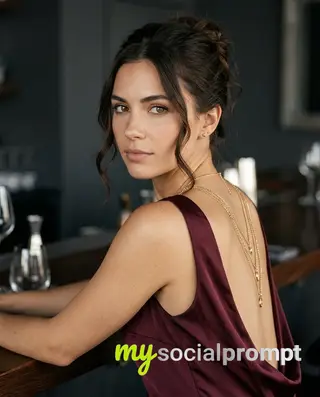
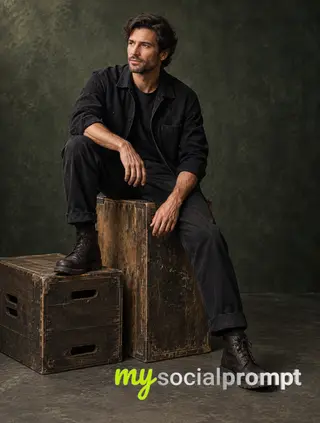
Create a sophisticated editorial portrait poster built around selective focus. Use a realistic photographic portrait with natural skin texture, pores, subtle imperfections, believable hair, and authentic facial structure. Avoid plastic skin, CGI smoothness, heavy beauty retouching, or generic commercial-model styling.

Keep most of the portrait softly blurred, slightly motion-softened, desaturated, or reduced in detail. Only the selected [Focus Method] should return to sharp detail, natural skin tone, and clear texture. The sharp and blurred areas must remain perfectly aligned as the same person and the same photographic moment, with no duplicated eyes, second face, or pasted-photo effect.

Choose one focus structure: a horizontal sharp band across the eyes, a small floating window isolating part of the face, a narrow vertical sharp slice through motion blur, or a larger offset frame that deliberately shifts attention away from the facial center.
Use a restrained neutral palette of charcoal, gray, warm beige, off-white, and natural skin tones. Use [Accent Color] as the only strong accent for the focus lines, main title, and a few key details. Keep the visual rule: Neutral Field + One Accent Color.

Use mature magazine-style typography: a high-contrast editorial serif for [Main Title], a condensed bold sans serif for [Name] and [Role], and a small neutral sans serif for secondary information. Include [Key Line] as meaningful copy connected to the subject and concept, not random filler text.

Keep the composition asymmetric with generous negative space. Let the portrait, typography, and focus geometry interact naturally. Add subtle film grain, light scan texture, and restrained print texture so the whole poster feels like one finished editorial piece.

The final result should feel like a polished independent fashion, photography, music, or culture magazine poster, with blur and sharpness deliberately controlling where the viewer looks.

Avoid cyberpunk HUDs, excessive UI graphics, neon gradients, gibberish text, logos, watermarks, numbering, sparkle symbols, harsh Gaussian blur, melted facial features, duplicated features, plastic skin, and over-retouching.
How to use this prompt
- Open Nano Banana (the model this prompt was written for). Most prompts also work in other image models with small edits.
- Join free to copy the full prompt and paste it as it is, JSON structure included.
- Replace the placeholders with your own subject: [Series Name], [Main Title], [Subject], [Name], [Role], [Key Line], [Accent Color], [Focus Method].
- Generate, then adjust one detail at a time (light, framing, style) until the result matches the examples on this page.
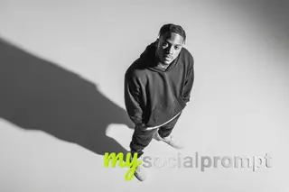
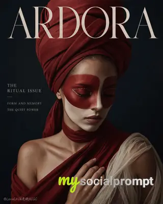
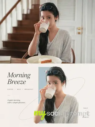
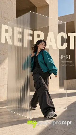
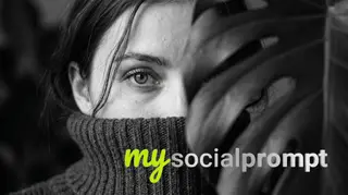
A sophisticated editorial portrait where controlled depth of field guides the viewer's gaze through a neutral, charcoal-and-beige field. The subject emerges from a softly blurred, desaturated atmosphere, with only a narrow band restored to natural skin texture and detail—an exercise in selective focus photography. High-contrast serif typography and a single accent color punctuate the asymmetric layout, while subtle film grain and print texture lend tactile authenticity. The result balances minimalist composition with emotional restraint. #EditorialPortrait #SelectiveFocus #MagazineDesign #AnalogTexture
Originally shared by Larus Canus (@MrLarus) view the original