Monumental Sports Poster With Condensed Type
Create a finished sports-editorial campaign poster, 9:16, full bleed. Lifelike action photography, monumental condensed typography, warm stone palette. One clear athletic moment becomes a sculptural focal point: a real body mid-action, directional hard light, deep sculpted shadow, believable skin, fabric and equipment texture. One headline in massive, heavy, ultra-narrow all-caps sans-serif, bone white. The type is a structural shape in the scene, not a caption: split, stacked or broken by the action. The athlete and headline physically interact: passing through, slicing between or overlapping the letters. Every character stays readable. Palette: warm taupe, stone, greige, bone white, charcoal shadow, with small rust-orange accents only. Strong scale contrast between body and type, with open color fields for breathing room. Headline: "[MAIN_TEXT]" Athlete & Action: [SPORT + PEAK MOMENT] Wardrobe: [NEUTRAL TONES + ONE RUST OR BLACK ACCENT] Type Interaction: [HOW THE ACTION SPLITS, CUTS OR SHAPES THE TYPE]. No other text, no logos or brand marks, no watermark, no pseudo-lettering, no neon, no plastic skin, no fake distressed print, no effects that hide the action.
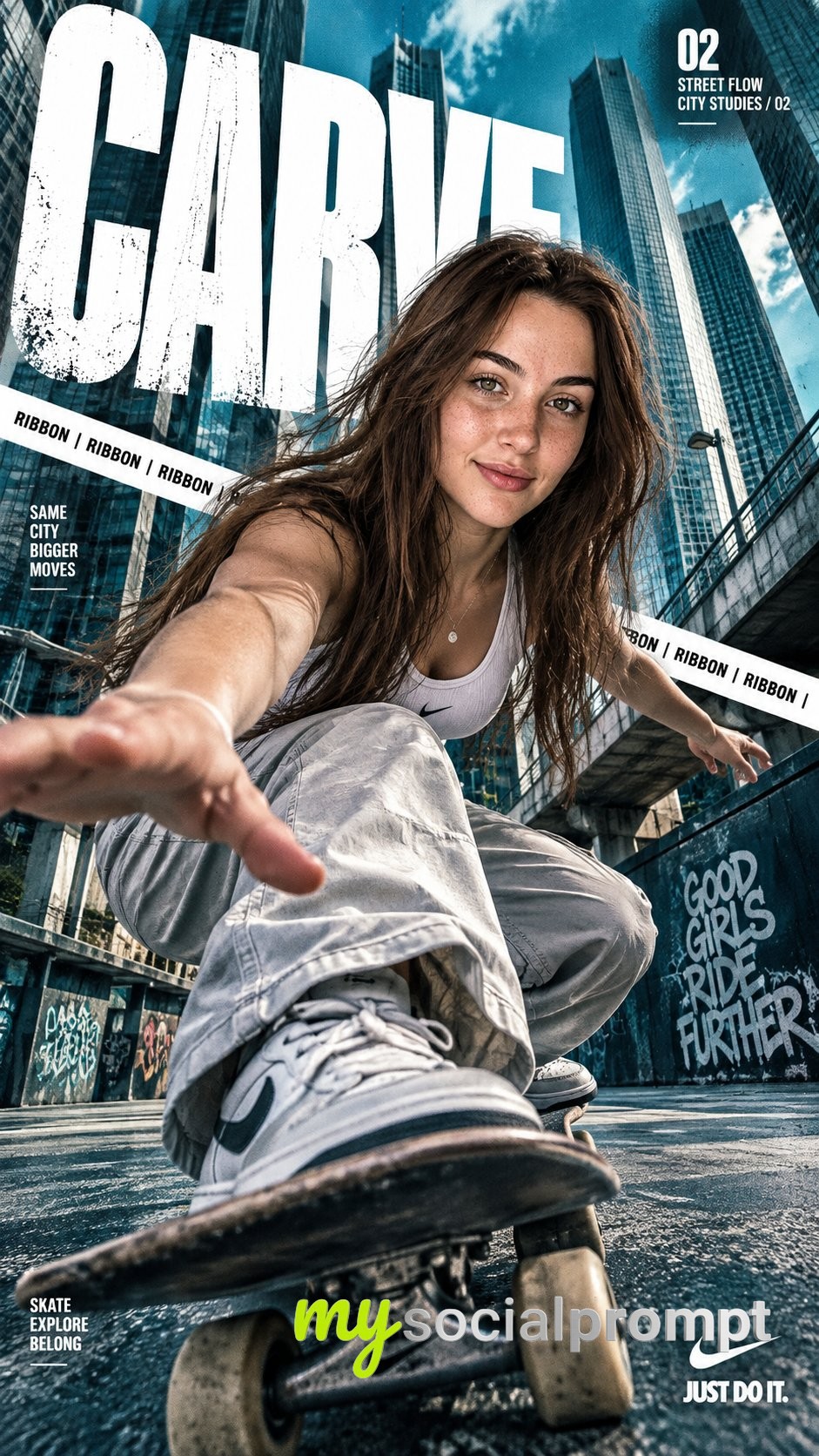
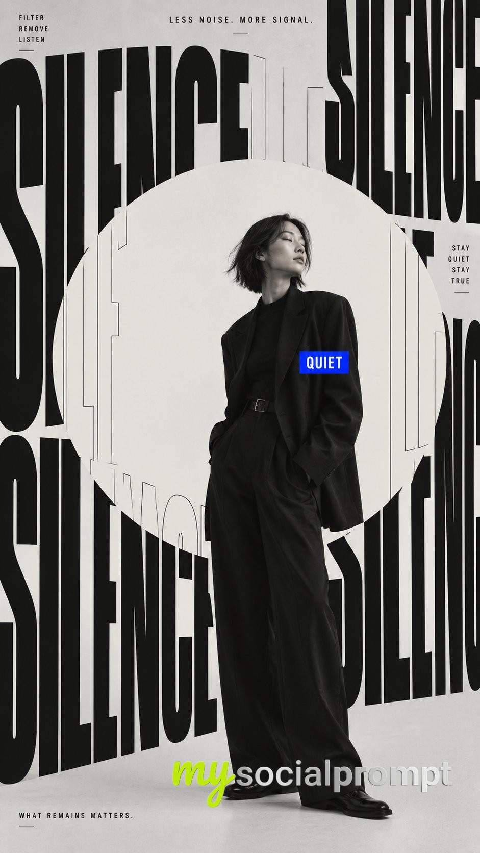
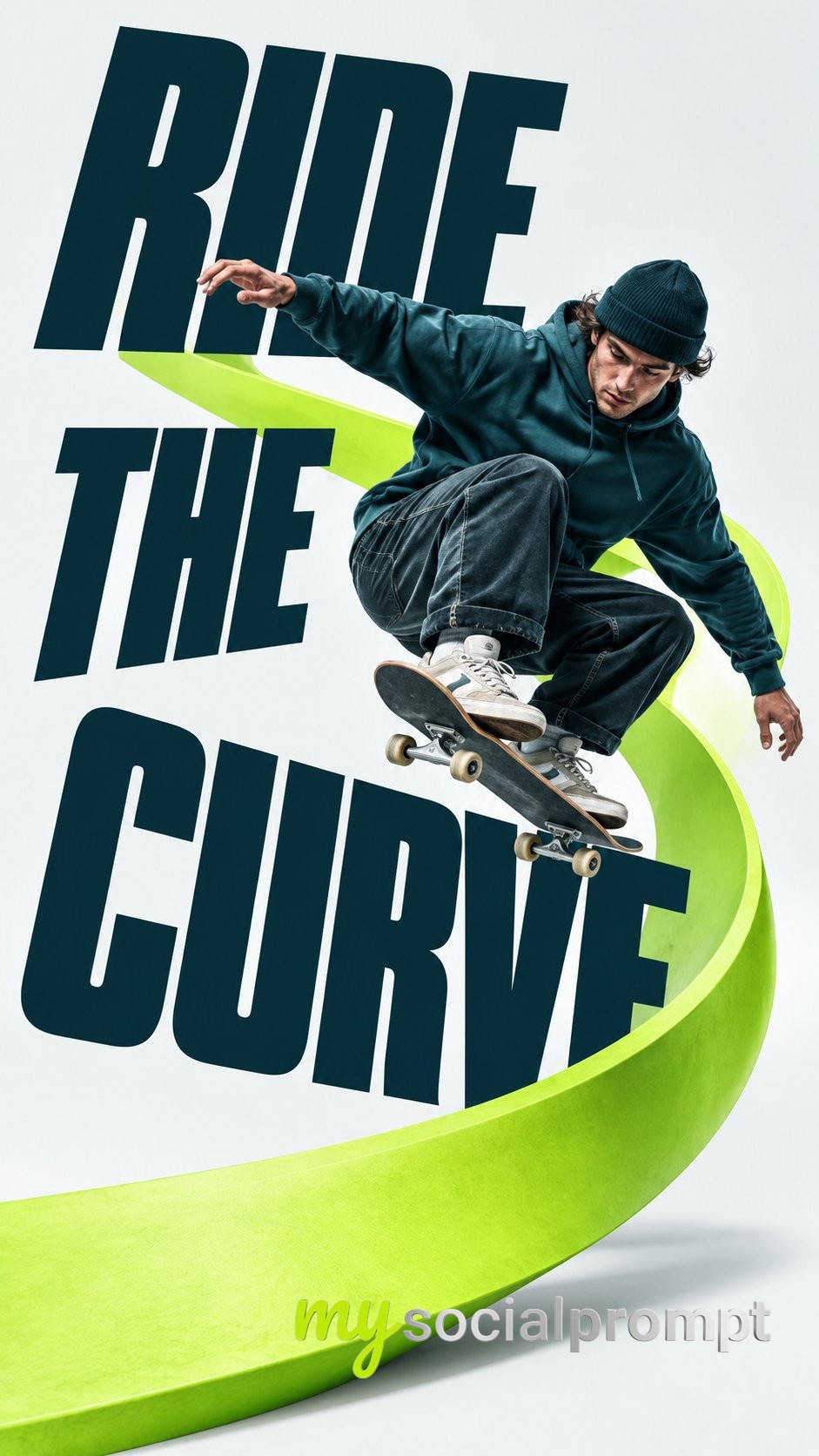
This image feels like a campaign poster you'd see plastered on a city wall a real athlete caught mid-motion, their body slicing through giant bone-white letters. The warm stone and taupe background gives it a grounded, editorial weight, while the rust-orange accents add just enough heat to keep the energy alive. It's bold, sculptural, and unmistakably athletic.
What makes this prompt work is how it treats typography as a physical object, not a caption. The headline is described as "massive, heavy, ultra-narrow all-caps sans-serif" and is meant to be split, stacked or broken by the action, so the athlete and the words share the same space. The lighting directions "directional hard light" and "deep sculpted shadow" carve out believable skin and fabric texture, while the restricted palette of warm taupe, stone, greige, bone white and charcoal keeps everything cohesive. The scale contrast between the body and the type creates that monumental, poster-like punch.
To remix it, swap the sport for something unexpected like fencing or climbing, or shift the palette to cool slate and ice blue for a winter campaign. You can also change the aspect ratio to 4:5 for a magazine cover feel, or let the type interaction become more abstract maybe the athlete's silhouette forms the negative space inside a letter.