Chiara Bianchi@chiara_bianchi · March 27, 2026 · 1 views
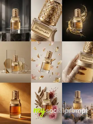
nanobanana prompt: Cinematic Luxury Perfume Photography with Dramatic Shadows
Luxury perfume product photography in a dark cinematic studio. A premium black matte perfume box with sharp edges and subtle gold accents placed slightly behind a transparent glass perfume bottle filled with warm amber liquid. The bottle has a thick clear glass body and a polished metallic cap. Minimal elegant label design with gold typography. Soft low key lighting with a smooth gradient dark background. Gentle reflections on a glossy surface beneath the products. Dramatic shadows for depth and contrast. High fashion fragrance advertisement style. Ultra realistic textures crisp focus shallow depth of field professional studio shot 8k quality.How to use this prompt
- Open Nanobanana (the model this prompt was written for). Most prompts also work in other image models with small edits.
- Join free to copy the full prompt and paste it as it is.
- Change the subject, the setting or the colors to make it yours; keep the structure.
- Generate, then adjust one detail at a time (light, framing, style) until the result matches the example on this page.
This prompt crafts a high-fashion fragrance advertisement through a masterful blend of Cinematic Lighting and Minimalist Composition, set in a dark studio for maximum impact. The artistic breakdown highlights a premium black matte perfume box with sharp edges and gold accents, paired with a transparent glass bottle filled with warm amber liquid, evoking luxury and sophistication. Soft low-key lighting creates a smooth gradient dark background, while gentle reflections on a glossy surface and dramatic shadows add depth and contrast, enhancing the ultra-realistic textures and crisp focus. The shallow depth of field and 8k quality ensure a professional studio shot that exudes elegance and high-end appeal. #LuxuryPhotography #ProductDesign #FragranceAd #CinematicStyle

Comments (1)
Sign in to join the conversation.
the matte-black box with gold typography is basically what i try to fake for cereal packaging and it never looks this clean. does the label survive if you swap the brand name, or does it start inventing letters? 🙃