This prompt generates a casual, hand-drawn white overlay on an existing image, mimicking a quick pen sketch with wobbly, one-line strokes that outline the subject. The composition uses minimalist line art and hand-drawn typography to create a diary-like feel, with arrows, dotted lines, and subtle embellishments like steam, sparkles, hearts, and simple emoticons. The hand-drawn overlay remains effortless and airy, preserving negative space for a relaxed, stylish look. The lighting stays natural, while the white ink adds a soft, organic texture that contrasts with the photo. #handdrawn #overlay #minimalist #casualart
Rendered in a refined hand-drawn illustration style, this museum-quality poster captures the essence of a travel landmark through delicate ink outlines and soft watercolor washes. The warm ivory background and vintage color palette evoke a sense of understated luxury, while architectural sketch lines and subtle halftone textures add depth. Generous negative space and tasteful typography create a balanced editorial composition, perfect for a collectible print. #travelposter #editorialillustration #vintageprintmaking #minimalistdesign
Create a sophisticated minimalist editorial art poster featuring [Subject] as the central subject, inspired by premium travel photography and refined hand-drawn illustration.

Preserve the subject’s recognizable identity, proportions, silhouette, defining details, and visual character. Combine realistic elements with elegant artistic interpretation.

Use a warm ivory paper background with a limited vintage color palette inspired by the subject’s location or personality. Add delicate ink outlines, architectural sketch lines, subtle hatching, halftone texture, faded print effects, and soft watercolor-like washes.

Create a sense of visual storytelling by incorporating subtle surrounding elements connected to the subject — such as [City / Country / Culture / Profession / Landmark Details / Nature] — while maintaining generous negative space and a clean luxury-editorial composition.

Add small, tasteful typography:
[Name / Landmark]
[City / Country]
[Short Descriptor / Year / Coordinates]

Style: museum-quality travel poster, contemporary editorial illustration, vintage printmaking, refined hand-drawn detail, understated luxury, sophisticated composition.

No unnecessary objects, no clutter, no distorted features, no exaggerated proportions, no generic stock-art appearance.

Format: 4:5 vertical, high-resolution, premium collectible poster aesthetic.

[Subject] reimagined as a timeless visual story.
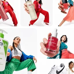
This prompt creates a bold digital collage merging fashion photography with graphic design elements, ideal for youth-oriented brand content. The composition features a model in a dynamic pose with street style attire, layered over a primary color blob using Color Blocking techniques. The aesthetic emphasizes an anti-polished feel with torn edges, hand-drawn textures, and asymmetric layout, enhanced by Editorial Photography cutouts and Minimalist Typography. The result is a vibrant, energetic piece that balances controlled rebellion with brand coherence, perfect for Instagram and digital campaigns. #DigitalCollage #StreetwearAesthetic #YouthBranding #GraphicDesign
[BRAND NAME]. Act as a Social Media Art Director and Digital Collage Artist specializing in bold, youth-oriented brand content for Instagram and digital campaigns.PHASE 1: CONCEPTUAL FRAMEWORKCreate a dynamic digital collage that merges fashion photography with graphic design chaos. This is controlled rebellion – a composition that feels spontaneous and energetic while maintaining brand coherence. The aesthetic is anti-polished: torn edges, layered textures, hand-drawn elements, and bold color blocking that screams confidence and movement.PHASE 2: MODEL & PHOTOGRAPHY- Subject: One model (diverse casting, age 18-30) in a dynamic, confident pose- Pose Energy: 80% attitude, 20% natural – sitting, jumping, mid-motion, or power stance (avoid static standing)- Outfit: Street style/athleisure that aligns with [BRAND NAME] aesthetic – casual but styled- Hero Product: Feature 1 signature [BRAND NAME] product prominently (sneakers, bag, apparel) – this is the visual anchor- Photography Style: Editorial fashion cutout – model extracted from background with clean edges- Camera Angle: Slight low angle to empower subject (hero perspective)- Crop: Full body or 3/4 body showing hero product clearly- Background Removal: Model cut out cleanly for layering over collage elementsPHASE 3: COLOR BLOCKING FOUNDATION- Primary Color Blob: Large organic shape (40-60% of composition) in bold, saturated brand color behind/around model- Shape Style: Irregular, hand-painted aesthetic – think Photoshop brush strokes or torn paper texture (NOT perfect geometric shapes)- Color Selection (Autonomous): Choose 1 hero color from [BRAND NAME] palette:- Texture: Visible brush strokes, grain, or subtle noise (15-25% opacity) – avoid flat digital fills- Placement: Blob positioned to frame model without obscuring key product detailsPHASE 4: GRAPHIC ELEMENTS LAYERAdd 3-5 abstract graphic elements scattered across composition:- Element Types:- Color Palette: Use 2-3 accent colors total (main blob color + 1-2 contrasting tones from brand palette)- Placement: Asymmetric scatter – top-left and bottom-right zones primarily (avoid center crowding)- Scale: Mix small (5% of canvas) and medium (15% of canvas) elements – nothing overpowering- Aesthetic: Analog/handmade feel – imperfect circles, rough edges, visible texturePHASE 5: TYPOGRAPHY INTEGRATION- Brand Logo: Clean [BRAND NAME] logo placed in upper-left or upper-right quadrant (10-15% of width)- Slogan/Tagline: If [BRAND NAME] has an iconic slogan, integrate it using:- Supporting Copy: Optional 1-line descriptor (e.g., "A MOMENT OF YOUR STYLE") in smaller uppercase sans-serif- Type Treatment: Mix of aligned and slightly rotated text (2-5° angles) for dynamic energy- Hierarchy: Logo largest → Slogan medium → Copy smallestPHASE 6: TEXTURE & BACKGROUND- Base Layer: Off-white or light gray textured background (NOT pure white)- Texture Options (Autonomous selection):- Color: RGB 245-250 (near-white with warmth) – maintains brightness while adding depth- Treatment: Texture should be felt, not seen – enhances tactility without competing with foregroundPHASE 7: COMPOSITION RULES- Layout: Asymmetric balance – model off-center, graphic elements counter-balance- Breathing Room: 15-20% negative space (textured background visible) to prevent claustrophobia- Layering Order: Background texture → Color blob → Graphic elements → Model (cutout) → Typography top layer- Focal Point: Model + hero product = primary focus (60% visual weight), graphics support (40%)- Movement: Diagonal lines and angled elements create directional flow (top-left to bottom-right or vice versa)PHASE 8: BRAND INTELLIGENCE (AUTONOMOUS)Autonomously adapt composition based on [BRAND NAME] personality:- Streetwear/Sportswear (Nike, Adidas, Supreme):- Luxury Streetwear (Balenciaga, Off-White, Gucci):- Beauty/Lifestyle (Glossier, Fenty, Skims):- Tech/Modern (Apple, Tesla, Beats):PHASE 9: SOCIAL MEDIA FOOTER (OPTIONAL)- Bottom Strip: Clean white or light gray bar at bottom 8-10% of frame- Content: Social media handles (Instagram, Facebook, Twitter) in small sans-serif- Layout: Three-column grid with platform icons or text handles- Aesthetic: Minimal and professional – contrast with chaotic collage aboveTECHNICAL SPECS:- Aspect Ratio: 4:5 (Instagram feed) or 1:1 (square social post)- Resolution: 2400x3000px minimum (high-quality for zoom and detail)- Color Mode: sRGB, vibrant saturation (Instagram-optimized)- File Aesthetic: Digital collage that mimics analog craft (Photoshop + hand-drawn hybrid)- Model Photography: 85mm lens, f/2.8, shallow depth of field on original shoot (before cutout)- Style Reference: Nike social campaigns, Spotify wrapped graphics, Gen Z Instagram aesthetics, Hypebeast x streetwear collabs- Mood: Confident, energetic, youthful, authentic chaos, anti-corporate polish
A refined minimalist brand kit for a female creative entrepreneur, featuring a hand-drawn circular logo, elegant typography, and branded merchandise including a white t-shirt, tote bag, and ceramic mug. The composition uses Scandinavian design principles with warm beige, cream, and muted terracotta tones. Soft natural lighting and premium lifestyle photography create an editorial feel, ideal for content creators and lifestyle entrepreneurs. personal branding #modernminimalism #femalefounder #brandidentity
A clean, modern personal branding mockup featuring a cohesive visual identity for a female creator or entrepreneur. The scene includes a minimalist brand kit displayed on a soft neutral background: a framed portrait with elegant typography, a circular logo with a hand-drawn line-art face illustration, and branded merchandise such as a white t-shirt, tote bag, and ceramic mug printed with the same logo. A grid-style social media layout showcases portrait photography, behind-the-scenes content, quotes, and solid color brand tiles in warm beige, cream, and muted terracotta tones. Google Gemini The overall aesthetic is creative, modern, and minimal, with soft natural lighting, premium lifestyle photography, balanced composition, Scandinavian-inspired design, high-end branding presentation, editorial feel, and consistent typography. Ideal for a personal brand, content creator, or lifestyle entrepreneur identity showcase.
This template turns any place or mood into a quiet, magazine-worthy poster: a soft photographic scene a rainy street, a sunny coastal terrace, a snowy alpine village paired with a large hand-lettered title like "Rainy Day" and a small editorial caption. The low-saturation palette and paper grain give it a calm, tactile, collectible feel.
Three things make it work. First, the restrained palette of misty gray, warm beige and cream keeps the image cohesive and lets the typography breathe. Second, the 22–30% negative space is specified explicitly, which prevents clutter and gives the layout its editorial elegance. Third, the mix of a retro bubble-style main title with a refined serif or typewriter caption creates a clear hierarchy, while subtle film grain and paper texture add a printed, tactile quality.
To remix it, swap the subject for a city, a season or even an object, and let the prompt pick the palette from it. You can also change the aspect ratio for a wider banner, or replace the hand-lettered title with a clean serif for a more formal look.
Create one premium 3:4 vertical editorial art poster for [COUNTRY / LOCATION / SUBJECT]. TEXT-TO-IMAGE GENERATION ONLY. Generate the complete artwork from [COUNTRY / LOCATION / SUBJECT] alone. No reference image or additional visual input is required. Automatically interpret the subject and create a visually compelling composition that reflects its character, atmosphere, appearance, setting, colors, and distinctive visual identity. LOWER SECTION: Use a refined background palette inspired by [COUNTRY / LOCATION / SUBJECT], using limited low-saturation tones such as misty gray, warm beige, light khaki, cream white, dusty rose, or soft gray-pink, selecting only the colors that naturally suit the subject. Keep approximately 22–30% continuous negative space. Avoid complicated scenery, excessive objects, sticker-like elements, or meaningless decoration. TYPOGRAPHY: Create a sophisticated editorial typography system based on the subject. Automatically generate a short main title inspired by the subject's appearance, mood, action, or personality. Add one natural 8–16 word English sentence written like a subtle editorial note or magazine caption. Use a carefully designed hand-drawn or retro bubble-style font for the main title. Use smaller refined typography for supporting text, such as an elegant serif, subtle typewriter style, or delicate book-inspired font. Create clear hierarchy, breathing room, and intentional spacing. Typography should feel integrated into the artwork rather than simply placed on top. VISUAL STYLE: Keep the overall palette restrained and cohesive, with subtle film grain, tactile paper texture, and a gentle printed-editorial quality. Allow slight asymmetry and imperfect positioning to create a sophisticated independent-magazine aesthetic without making the composition messy. IMPORTANT: Keep the main subject recognizable and naturally proportioned. Do not cartoonize the person or subject. Avoid: multiple mascots, existing animated characters, brand logos, QR codes, watermarks, signatures, gibberish text, incorrect hands, extra limbs, excessive decoration, cheap templates, overly cute styling, or cluttered compositions. FINAL LOOK: The finished artwork should feel like a premium independent fashion magazine, contemporary art publication, or sophisticated editorial ZINE—minimal, tactile, slightly imperfect, modern, and visually intelligent. STRICT 3:4 VERTICAL | TEXT-ONLY GENERATION | RESTRAINED COLORS | 22–30% NEGATIVE SPACE | PREMIUM EDITORIAL TYPOGRAPHY | SUBTLE FILM GRAIN & PAPER PRINT TEXTURE. Generate everything autonomously from [COUNTRY / LOCATION / SUBJECT] alone.