Results for “hand drawn typography”

6 prompts

Studio Papillon@studio_papillon · Mar 15 · Nanobanana
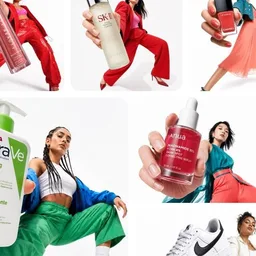
nanobanana prompt: Dynamic Digital Collage with Streetwear Fashion and Graphic Chaos
This prompt creates a bold digital collage merging fashion photography with graphic design elements, ideal for youth-oriented brand content. The composition features a model in a dynamic pose with street style attire, layered over a primary color blob using Color Blocking techniques. The aesthetic emphasizes an anti-polished feel with torn edges, hand-drawn textures, and asymmetric layout, enhanced by Editorial Photography cutouts and Minimalist Typography. The result is a vibrant, energetic piece that balances controlled rebellion with brand coherence, perfect for Instagram and digital campaigns. #DigitalCollage #StreetwearAesthetic #YouthBranding #GraphicDesign
[BRAND NAME]. Act as a Social Media Art Director and Digital Collage Artist specializing in bold, youth-oriented brand content for Instagram and digital campaigns.PHASE 1: CONCEPTUAL FRAMEWORKCreate a dynamic digital collage that merges fashion photography with graphic design chaos. This is controlled rebellion – a composition that feels spontaneous and energetic while maintaining brand coherence. The aesthetic is anti-polished: torn edges, layered textures, hand-drawn elements, and bold color blocking that screams confidence and movement.PHASE 2: MODEL & PHOTOGRAPHY- Subject: One model (diverse casting, age 18-30) in a dynamic, confident pose- Pose Energy: 80% attitude, 20% natural – sitting, jumping, mid-motion, or power stance (avoid static standing)- Outfit: Street style/athleisure that aligns with [BRAND NAME] aesthetic – casual but styled- Hero Product: Feature 1 signature [BRAND NAME] product prominently (sneakers, bag, apparel) – this is the visual anchor- Photography Style: Editorial fashion cutout – model extracted from background with clean edges- Camera Angle: Slight low angle to empower subject (hero perspective)- Crop: Full body or 3/4 body showing hero product clearly- Background Removal: Model cut out cleanly for layering over collage elementsPHASE 3: COLOR BLOCKING FOUNDATION- Primary Color Blob: Large organic shape (40-60% of composition) in bold, saturated brand color behind/around model- Shape Style: Irregular, hand-painted aesthetic – think Photoshop brush strokes or torn paper texture (NOT perfect geometric shapes)- Color Selection (Autonomous): Choose 1 hero color from [BRAND NAME] palette:- Texture: Visible brush strokes, grain, or subtle noise (15-25% opacity) – avoid flat digital fills- Placement: Blob positioned to frame model without obscuring key product detailsPHASE 4: GRAPHIC ELEMENTS LAYERAdd 3-5 abstract graphic elements scattered across composition:- Element Types:- Color Palette: Use 2-3 accent colors total (main blob color + 1-2 contrasting tones from brand palette)- Placement: Asymmetric scatter – top-left and bottom-right zones primarily (avoid center crowding)- Scale: Mix small (5% of canvas) and medium (15% of canvas) elements – nothing overpowering- Aesthetic: Analog/handmade feel – imperfect circles, rough edges, visible texturePHASE 5: TYPOGRAPHY INTEGRATION- Brand Logo: Clean [BRAND NAME] logo placed in upper-left or upper-right quadrant (10-15% of width)- Slogan/Tagline: If [BRAND NAME] has an iconic slogan, integrate it using:- Supporting Copy: Optional 1-line descriptor (e.g., "A MOMENT OF YOUR STYLE") in smaller uppercase sans-serif- Type Treatment: Mix of aligned and slightly rotated text (2-5° angles) for dynamic energy- Hierarchy: Logo largest → Slogan medium → Copy smallestPHASE 6: TEXTURE & BACKGROUND- Base Layer: Off-white or light gray textured background (NOT pure white)- Texture Options (Autonomous selection):- Color: RGB 245-250 (near-white with warmth) – maintains brightness while adding depth- Treatment: Texture should be felt, not seen – enhances tactility without competing with foregroundPHASE 7: COMPOSITION RULES- Layout: Asymmetric balance – model off-center, graphic elements counter-balance- Breathing Room: 15-20% negative space (textured background visible) to prevent claustrophobia- Layering Order: Background texture → Color blob → Graphic elements → Model (cutout) → Typography top layer- Focal Point: Model + hero product = primary focus (60% visual weight), graphics support (40%)- Movement: Diagonal lines and angled elements create directional flow (top-left to bottom-right or vice versa)PHASE 8: BRAND INTELLIGENCE (AUTONOMOUS)Autonomously adapt composition based on [BRAND NAME] personality:- Streetwear/Sportswear (Nike, Adidas, Supreme):- Luxury Streetwear (Balenciaga, Off-White, Gucci):- Beauty/Lifestyle (Glossier, Fenty, Skims):- Tech/Modern (Apple, Tesla, Beats):PHASE 9: SOCIAL MEDIA FOOTER (OPTIONAL)- Bottom Strip: Clean white or light gray bar at bottom 8-10% of frame- Content: Social media handles (Instagram, Facebook, Twitter) in small sans-serif- Layout: Three-column grid with platform icons or text handles- Aesthetic: Minimal and professional – contrast with chaotic collage aboveTECHNICAL SPECS:- Aspect Ratio: 4:5 (Instagram feed) or 1:1 (square social post)- Resolution: 2400x3000px minimum (high-quality for zoom and detail)- Color Mode: sRGB, vibrant saturation (Instagram-optimized)- File Aesthetic: Digital collage that mimics analog craft (Photoshop + hand-drawn hybrid)- Model Photography: 85mm lens, f/2.8, shallow depth of field on original shoot (before cutout)- Style Reference: Nike social campaigns, Spotify wrapped graphics, Gen Z Instagram aesthetics, Hypebeast x streetwear collabs- Mood: Confident, energetic, youthful, authentic chaos, anti-corporate polish
Imogen Clarke@imogen_clarke · Jul 28 · Nano Banana
nanobanana prompt: Minimalist Personal Brand Mockup for Female Creator
A refined minimalist brand kit for a female creative entrepreneur, featuring a hand-drawn circular logo, elegant typography, and branded merchandise including a white t-shirt, tote bag, and ceramic mug. The composition uses Scandinavian design principles with warm beige, cream, and muted terracotta tones. Soft natural lighting and premium lifestyle photography create an editorial feel, ideal for content creators and lifestyle entrepreneurs. personal branding #modernminimalism #femalefounder #brandidentity
A clean, modern personal branding mockup featuring a cohesive visual identity for a female creator or entrepreneur. The scene includes a minimalist brand kit displayed on a soft neutral background: a framed portrait with elegant typography, a circular logo with a hand-drawn line-art face illustration, and branded merchandise such as a white t-shirt, tote bag, and ceramic mug printed with the same logo. A grid-style social media layout showcases portrait photography, behind-the-scenes content, quotes, and solid color brand tiles in warm beige, cream, and muted terracotta tones. Google Gemini The overall aesthetic is creative, modern, and minimal, with soft natural lighting, premium lifestyle photography, balanced composition, Scandinavian-inspired design, high-end branding presentation, editorial feel, and consistent typography. Ideal for a personal brand, content creator, or lifestyle entrepreneur identity showcase.
Chloe H.@chloe_h · Apr 15 · Nanobanana
nanobanana prompt: Minimalist Branding Mockup with Scandinavian Design
This sophisticated personal branding mockup exemplifies contemporary visual identity through its Minimalist Composition and Scandinavian-inspired Design. The scene presents a cohesive brand kit on a soft neutral background, featuring a framed portrait with elegant typography and a circular logo with hand-drawn line-art. Branded merchandise—including a white t-shirt, tote bag, and ceramic mug—reinforces the identity, while a grid-style social media layout showcases portrait photography, behind-the-scenes content, and solid color tiles in warm beige, cream, and muted terracotta tones. The aesthetic is elevated by soft natural lighting, premium lifestyle photography, and balanced composition, creating an editorial feel ideal for content creators and lifestyle entrepreneurs. #PersonalBranding #VisualIdentity #MinimalistDesign #BrandMockup
Image I generated using Nano Banana Pro model on @SocialSight . You can upload your own image to create it.Prompt :A clean, modern personal branding mockup featuring a cohesive visual identity for a female creator or entrepreneur. The scene includes a minimalist brand kit displayed on a soft neutral background: a framed portrait with elegant typography, a circular logo with a hand-drawn line-art face illustration, and branded merchandise such as a white t-shirt, tote bag, and ceramic mug printed with the same logo. A grid-style social media layout showcases portrait photography, behind-the-scenes content, quotes, and solid color brand tiles in warm beige, cream, and muted terracotta tones. Google Gemini The overall aesthetic is creative, modern, and minimal, with soft natural lighting, premium lifestyle photography, balanced composition, Scandinavian-inspired design, high-end branding presentation, editorial feel, and consistent typography. Ideal for a personal brand, content creator, or lifestyle entrepreneur identity showcase.
Francesca R.@francesca_r · Jun 2 · Nanobanana
nanobanana prompt: Raw Street Culture Editorial Poster for Supreme — Bold Brushstroke Logo, Graffiti Tag Overlay, Documentary Photography
This editorial design brief channels the raw energy of underground magazine covers from Thrasher, i-D, and Dazed. The image is built on a real location photograph — a skateboarder caught mid-air in a gritty Brooklyn parking lot at golden hour, natural light creating dramatic shadows. The cinematic lighting and street photography aesthetic provide a documentary feel. The composition is anchored by an enormous hand-painted brushstroke version of the Supreme box logo, covering 80% of the canvas width, with visible bristle marks and paint drips. A neon red graffiti tag overlay adds authenticity, while the typography system creates an editorial grid. The final piece balances minimalist design with raw subcultural grit. #StreetCulture #EditorialDesign #Supreme #GraffitiInspired
[BRAND NAME]Act as a Senior Street Culture Art Director and Editorial Designer specializing in authentic underground magazine covers and campaign posters that feel documentary rather than commercial. Your reference universe: Thrasher Magazine, i-D, The Face, Dazed — raw, real, typographically bold.BRAND INTELLIGENCE SYSTEMBefore executing, resolve: (1) HERO SUBJECT — identify the most authentic human archetype or iconic product moment associated with [BRAND NAME]'s world. Autonomously determine what this looks like based purely on the brand's identity — a person interacting with the brand's hero product in their most natural environment, or the hero product itself as the sole subject if no human archetype is more powerful. The subject must feel like it belongs to this brand's specific world — not borrowed from another brand's cultural universe. Never default to skateboarding, skating, or street sport unless [BRAND NAME] is specifically and primarily a skate brand, (2) ENVIRONMENT — the most iconic real-world location context for [BRAND NAME]'s subject — not a studio, always a real place with atmosphere: a rooftop, a street, a race track, a kitchen, a parking lot, a coastline, a salon, a garage, a runway, (3) BRAND WORDMARK STYLE — identify how [BRAND NAME]'s name would look rendered as a rough hand-painted or chalk brushstroke headline — the texture and character of the lettering must feel native to the brand's specific subculture and communication style, (4) NEON ACCENT COLOR — identify one single neon or highly saturated accent color that feels culturally connected to [BRAND NAME]'s world — this will be used exclusively for the graffiti tag overlay and nowhere else, (5) QUOTE LINE — autonomously generate a short authentic-sounding quote or phrase in [BRAND NAME]'s voice — 4–6 words, raw and real, not corporate, not generic.PHASE 1: PHOTOGRAPHY BASEThe entire image is built on a real location photograph — not a studio shot, not a white background, not a cyclorama. The environment resolved in the brand intelligence system is the setting. Natural or available light only — no softboxes, no controlled studio lighting. The light should feel like it was taken at golden hour, overcast day, or in existing ambient conditions. Camera angle: dynamic and committed — low angle looking up for power, or a dramatic dutch tilt for tension, never flat eye-level. The subject is captured at peak energy — the single most alive frame of the action or moment. The photograph fills the entire canvas edge to edge with no padding. Color grade: slightly pushed contrast, natural colors preserved, filmic grain, not over-processed. This photograph must feel like it was taken by a photographer who was actually there — not staged, not art directed to death.PHASE 2: BRAND LOGO BRUSHSTROKE — CRITICALAutonomously identify [BRAND NAME]'s primary icon mark or logo symbol — the exact recognizable shape  that represents this brand visually. Render this logo mark as a large hand-painted brushstroke version — as if a skilled street artist took a wide brush loaded with paint and painted the logo freehand on a wall. The shape must be immediately recognizable as [BRAND NAME]'s actual logo geometry — correct proportions, correct silhouette, correct internal details — but executed in a loose, gestural, brush-painted style with visible bristle marks, paint drips, slightly uneven edges, and areas where the paint is thinner and the surface shows through. This is not a clean vector trace — it is a human hand interpreting a logo with a brush. Size: enormous — spanning 70–85% of canvas width, occupying the upper third of the canvas. Color: white or off-white paint — reading clearly against the photograph behind it. The brushstroke logo sits on top of the photograph as an overlay with natural paint transparency in the thinner areas.PHASE 3: GRAFFITI TAG OVERLAYOne single graffiti element in the NEON ACCENT COLOR resolved in the brand intelligence system. This element is a loose hand-drawn tag, throw-up, or marker scrawl — a secondary word, a symbol, an abstract mark, or a stylized brand-relevant word. It sits on top of everything — over the photograph, over the wordmark, over any other element — as if added last and spontaneously, like someone tagged the poster after it was printed. Placement: partially overlapping the brand wordmark in the upper portion of the image with additional marks or drips extending into the mid-section of the canvas. The neon accent color is used nowhere else in the entire composition — this element owns that color exclusively. The graffiti mark adds rawness and authenticity — it breaks the polish and makes the whole thing feel real.PHASE 4: TYPOGRAPHY SYSTEMFour distinct text zones — all small, all restrained, creating an editorial layout grid around the large wordmark and photograph. UPPER LEFT BLOCK: 3–4 lines of very small all-caps or mixed case body text describing [BRAND NAME]'s campaign, collection, or brand context — autonomously generate relevant editorial copy in [BRAND NAME]'s voice. This block sits in the top-left corner, justified left, at footnote scale. TWO LABEL LINES: directly below the upper left block — a campaign name or season on the left, a short descriptor on the right — both in small caps, same scale as body text. RIGHT MID BLOCK: the QUOTE LINE resolved in the brand intelligence system rendered in quotation marks in the right-center area, slightly larger than body text but still small relative to the wordmark. Below the quote: [BRAND NAME] in small caps as attribution. Below that: 3–4 lines of small body copy with [BRAND NAME]'s campaign message — autonomously generate relevant content. LOWER RIGHT DETAIL: a small secondary graffiti-style tag or signature mark in the neon accent color — smaller than the main graffiti element, positioned lower right as a finishing mark.PHASE 5: OVERALL COMPOSITIONThe visual hierarchy reads in this exact order: (1) the photograph and its energy — the eye enters through the action or subject, (2) the massive brushstroke wordmark — confirms the brand, (3) the neon graffiti tag — adds rawness and surprise, (4) the typography blocks — rewards closer reading. The composition must feel like a real magazine cover or a poster wheat-pasted on a wall — not a social media graphic, not a clean digital mockup. Every element has a reason to exist. Nothing is decorative. The rawness is the design.TECH SPECSPhotography: real location, natural light, peak moment, filmic color grade with visible grain. Wordmark: textured brushstroke or chalk — never clean vector. Graffiti: one neon accent color only, hand-drawn quality, sits on top of all layers. Typography: small, editorial, restrained — maximum 4 text blocks. Color palette: natural photograph tones plus one neon accent color only — no additional colors introduced anywhere. No geometric shapes, no illustrated elements, no icons, no additional graphic overlays beyond what is specified. The graphic language is exclusively photography plus typography plus one graffiti accent. Mood: a poster designed by someone who actually lives in this brand's world — not an agency, not a committee, one person with a strong point of view and complete conviction.PHOTOGRAPHY TONE — CRITICAL: the subject must be clean, sharp, and well-lit despite the raw editorial aesthetic. Raw and authentic refers to the composition style and location — NOT to dirt, sweat, mud, or degraded appearance of the subject. The person or product must look aspirational and desirable. No dirt. No sweat. No mud. No torn clothing. No gritty degraded appearance. Editorial rawness means honest and unposed — not physically dirty.
CR
Camila Rocha@camila_rocha · Jul 4 · Nanobanana
nanobanana prompt: Movie Poster Reimagined as Child's Crayon Drawing on Lined Paper
A nostalgic reinterpretation of a classic movie poster, rendered entirely as a child's crayon drawing on lined notebook paper. Every element—from character poses to typography—is preserved, but the execution shifts to wobbly, unsteady lines and uneven coloring that strays outside the lines. The background is filled with heavy crayon scribble strokes, while the red margin line of the paper remains visible. Text is redrawn in shaky hand-lettered crayon matching the original font placement. This piece celebrates naive art and the charm of childlike creativity, evoking a sense of nostalgia through its flat scan and subtle paper texture. #crayonart #notebookart #movietribute
Transform this movie poster into a child’s crayon drawing on lined notebook paper. Every compositional element, character pose, typography, color palette, and layout is preserved exactly as the original — only the art style has changed. Drawn in colored pencil and crayon with wobbly unsteady lines, uneven coloring that goes slightly outside the lines, basic facial features, simplified anatomy. Background filled with heavy crayon scribble strokes. Lined notebook paper visible underneath, including the red margin line. Text redrawn in shaky hand-lettered crayon matching the original font placement. Flat scan of the drawing, slight paper texture.

That is the free preview

Create an account to keep scrolling, like and save prompts, follow the creators you like, and share your own.