Split Editorial Poster With Geometric Color Window
Premium Editorial Poster Instructions

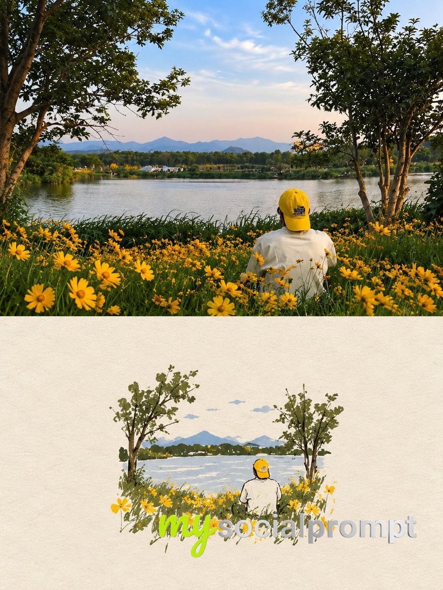
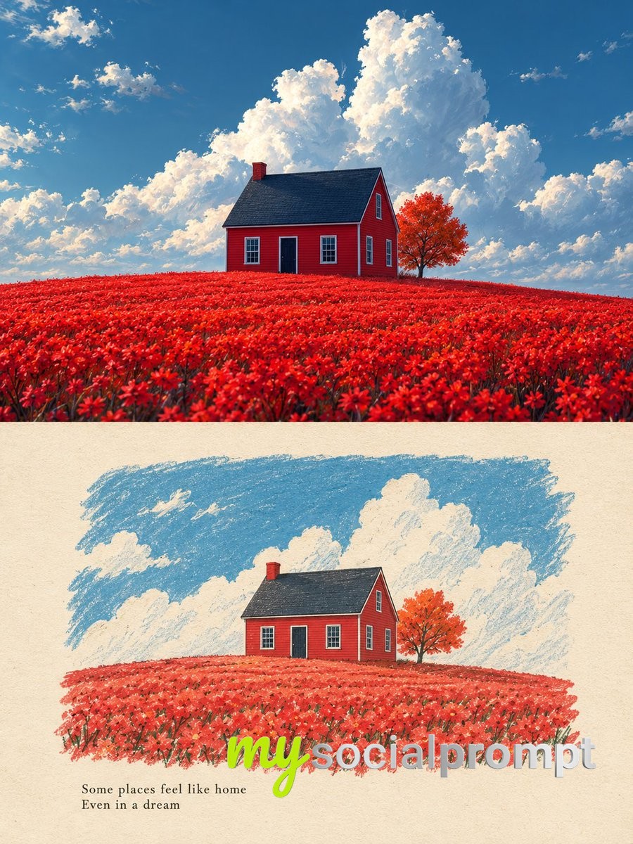
Each uploaded photo must be made into a separate, independent, premium editorial poster, and multiple photos must not be combined. Use a strict 3:4 vertical canvas. Split the canvas horizontally in the exact center: the upper half and the lower half each occupy 50% of the height, are equally wide, and equally high, with no alteration of proportion.

The upper half uses the original photo directly and must not be regenerated. Preserve the identity of the main subject, the human body or architectural structure, proportions, perspective, spatial relationships, texture, natural light and shadow, color, and environment in their entirety. Only slight cropping and restrained premium color grading are permitted; re-drawing the main subject, fictional light, HDR, excessive saturation, plastic texture, and fictional content are prohibited. When needing to adapt to the frame, only environmental areas such as sky, water surface, ground, walls, plants, or background can be extended.

The lower half extracts and reconstructs the "narrative core" of the photo: it can be a single primary subject, or a group of related elements that together embody the photo's identity, scale, action, or story relationship. Maintain its realistic, recognizable appearance, proportion, internal structure, texture, and relative position. Do not remove important related elements, and do not directly use rectangular photo cutouts. The reconstructed subject typically occupies 55%-80% of the width of the lower area. It should naturally extend based on the photo's primary direction and retain plausible ground, water lines, shadows, or softly dissipated edges to integrate into the background, avoiding a sticker-like or floating appearance.

Incorporate a narrow, low-saturation geometric color field behind or through the center of the subject, serving as a "critical window" between reality and editorial abstraction. The color of the window must be extracted from the original photo, and its orientation (horizontal, vertical, or diagonal) chosen based on the overall narrative direction.

The subject must actively pass through the window: part of it is within the color field, and part enters the open negative space, naturally crossing the window's boundary to create occlusion, penetration, and spatial depth. The window is not a frame or a card; it must not fully enclose the subject. Only one primary window is allowed; multiple color blocks, thick borders, rounded corners, strong gradients, and drop shadows are prohibited.

Use a white, cool white, very light gray, or near-white background for the lower half, coordinated with the photo. Employ a restrained asymmetrical composition and abundant negative space to establish a three-tier hierarchy:

Reconstructed subject or narrative composition

Low-saturation geometric windowThis editorial poster template turns a single photograph into a refined, magazine-ready composition. The top half keeps the original image untouched, while the bottom half rebuilds its narrative core against a clean near-white background, crossed by a narrow, low-saturation geometric color window. The result feels like a quiet gallery print precise, airy, and quietly luxurious.
Three techniques make it work. First, the strict 50/50 horizontal split creates instant balance and rhythm, so the eye reads photo first, then story. Second, the "critical window" a slim color field sampled from the original image acts as a bridge between reality and editorial abstraction, adding depth without decoration. Third, the subject is made to physically pass through that window, creating occlusion and spatial layering that avoids the flat, sticker-like look common in poster prompts.
To remix it, swap the subject for a product, a pet, or an architectural detail, and pull the window color from a different part of the photo to shift the mood. Try a 4:5 canvas for Instagram or a 2:3 for print, and keep the negative space generous that emptiness is what makes the composition feel premium.