TITLE: [Your Title] SUBJECT: [Model Styling Expression] EDITORIAL MECHANISM: [Type Mask / Unequal Portrait Panels / Repeated Crops / Edge Tension] ACCENT COLOR: [Cobalt / Acid Yellow / Burnt Amber / Vermilion / Another Single Accent] FORMAT: 9:16 vertical poster Create a premium experimental fashion editorial poster where portrait photography becomes part of the layout itself rather than simply sitting behind typography. Begin with a strong, realistic fashion portrait with natural skin texture, distinctive styling, clear facial emotion and a confident editorial silhouette. Use black-and-white or restrained neutral photography as the base, then introduce only one controlled accent color. Deconstruct and reorganize the portrait through one dominant editorial mechanism. The image may appear inside oversized letterforms, split into unequal photographic columns, repeat through differently scaled facial crops, break beyond its frame, or be pushed toward the page edge so the entire layout reacts to the subject. Treat cropping as a design tool. Use close facial fragments, eyes, hands, shoulders or full-body silhouettes at different scales. Allow selected elements to cross image boundaries, typography or color fields so the composition never feels like a rigid grid. Typography should actively construct the page. Combine one monumental display word with refined serif or condensed sans-serif supporting type. Let large letters overlap portraits, disappear behind subjects, extend beyond the canvas or behave like masks and architectural forms. Pair them with concentrated micro editorial copy, vertical edge text and a few precise alignment rules. Use color as structure rather than decoration. Introduce one bold cobalt, acid yellow, burnt amber, vermilion or similar accent as a large block, narrow spine, transparent window or irregular field that changes the relationship between photography and typography. Maintain deliberate information density: a visually dense central or edge zone balanced by quieter negative space. Small text should be grouped into a few clear editorial information islands instead of being scattered everywhere. Use asymmetry, extreme scale contrast, controlled misalignment, partial cropping and layered foreground/background relationships. The final poster should feel like a sophisticated independent fashion magazine, experimental editorial spread and contemporary art-direction piece combined. At thumbnail size, the image should still have one immediate visual hook: a large face, monumental word, bold color field, unusual crop or striking fashion silhouette. On closer inspection, reveal secondary layers of typography, repeated photography, micro copy and frame-breaking details. Avoid generic centered magazine covers, simple photo-plus-text layouts, perfectly even grids, decorative color blocks, excessive empty minimalism, random symbols, fake UI graphics, meaningless dense text, logos, watermarks, barcodes, issue numbers, plastic skin and multiple competing accent colors.
posterdesign
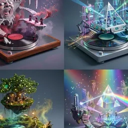
Every prompt tagged posterdesign.
Create a premium 4:5 vertical automotive editorial poster featuring a [Year] [Car] in [Color], captured from an aggressive low three-quarter perspective as it speeds through [Scenery]. Emphasize the car’s authentic proportions, distinctive body lines, aerodynamic surfaces, wheels, headlights, grille, reflections, and mechanical details while maintaining a dynamic sense of forward motion. Build the artwork around expressive hand-painted brush strokes, sweeping diagonal marks, controlled ink splashes, dry-brush textures, screen-printed grain, subtle halftone patterns, bold graphic shadows, and layered atmospheric shapes. Add directional motion trails, subtle environmental blur, dust or road particles, and energetic background strokes that reinforce speed without obscuring the vehicle. Use a sophisticated high-contrast palette of [Colors], with carefully balanced highlights, deep shadows, and selective accent tones. Keep the composition bold but refined, combining vintage motorsport graphics with contemporary automotive editorial design. Place the large, clean geometric sans-serif title “[Title]” prominently at the top, with the bold editorial headline “[Headline]” integrated naturally into the artwork. Position the authentic [Brand] logo cleanly at the bottom, maintaining accurate proportions and strong visual hierarchy. Crisp illustrated vehicle detailing, dramatic perspective, tactile print texture, refined typography, balanced negative space, premium poster composition, energetic retro racing aesthetic, sophisticated editorial finish, highly polished 4:5 vertical format.
Create a finished editorial campaign poster, 9:16, full bleed. Monumental condensed typography, one real material shot up close, a single bold color field. One tactile subject photographed at dramatic scale: fine texture, precise directional light, sparse art direction, nothing else in frame. A small object can feel monumental; a huge structure can feel intimate. One headline in giant, heavy, condensed uppercase sans-serif, clean solid white or cream, never distressed. The subject and type interlace in depth: the subject passes in front of one letter edge and behind another, or slips through the gap between the two words. Every letter stays readable. Headline: "[Main Text]" Subject: [Material Or Object Its State] Camera: [Angle Scale] Palette: [One Saturated Field Subject Tones White Type] Type Interaction: [Where The Subject Crosses Or Splits The Words] No extra text or punctuation, no logos, no watermark, no distressed lettering, no aged paper or sepia filter, no plastic or render-like materials. 01 RAW FORM · clay under pressure · lilac studio Two clay-coated hands shaping the walls of a wet vessel on the wheel, glossy throwing ridges under grazing light. Type interaction: the vessel rim rises in front of FORM, with RAW stacked high in open lilac. 02 SLOW BURN · macro match · soot black One wooden match at extreme macro scale, blistered charred head, a thin amber flame rising. Type interaction: the match runs diagonally through the channel between SLOW and BURN; the flame tip grazes a letter. 03 WIDE OPEN · desert arch · turquoise sky Sand concrete pavilion alone in a pale desert, one tall arch framing a flat horizon, long hard shadow. Type interaction: WIDE sits above the wall; OPEN reads through the sky inside the arch. 04 SOFT POWER · airborne silk · deep aubergine One long vermilion silk billowing in an S-curve, translucent peach edges lit from the side. Type interaction: the silk weaves in front of SOFT and behind POWER, alternating fold by fold.
This vertical poster captures a young athlete mid-swing on a professional tennis court, her Apple Watch Series 12 gleaming at the center of a precise metallic motion trail. The oversized, cropped word "TIME" anchors the composition, while clean white space and soft silver gradients give the whole piece a calm, premium commercial energy.
The prompt works because it layers three concrete techniques: a bold Swiss-minimalist layout with generous negative space, which keeps the eye on the product; photorealistic product advertising language, which ensures the watch and athlete look tangible rather than illustrated; and the circular motion trail around the watch face, a controlled graphic device that ties time, movement, and the sport into one visual idea. Details like thin measurement lines and subtle metallic reflections add a technical, trustworthy feel without tipping into fantasy.
To remix it, swap the tennis player for a runner, cyclist, or dancer and change the accent color from silver to a warm metallic tone. You can also adjust the aspect ratio to 1:1 for social feeds, or replace the giant "TIME" with a different single word that matches your product's core promise.
APPLE WATCH SERIES 12 — “TIME MOVES WITH YOU” 4:5 vertical premium poster, 8K, bold commercial layout × Swiss minimalism × photorealistic product advertising CORE IDEA: “TIME, IN MOTION.” LAYOUT: BACKGROUND BLOCK: Large rounded rectangle in clean Apple white with a subtle silver gradient and soft architectural shadows GIANT TYPOGRAPHY: “TIME” bold, oversized, cropped, sitting behind subject and product SUBJECT: Athletic young adult in motion on a professional tennis court Apple Watch Series 12 clearly visible on wrist natural movement, realistic skin and fabric premium commercial sports photography PRODUCT + CONCEPTUAL TWIST: Apple Watch Series 12 becomes the visual center of the action → A precise circular motion trail extends from the watch face around the athlete: thin metallic arc, subtle translucent rings, perfectly controlled geometry, realistic reflections, no fantasy effects. The circular form visually connects time, movement, and the athlete’s motion while keeping the watch completely photorealistic. GRAPHIC ELEMENTS: minimal geometric ticks, thin measurement lines, subtle metallic reflections, small typographic annotations, generous negative space TEXT SYSTEM: Top pill: “Apple Watch Series 12” Small text: “Designed for movement.” BOTTOM FEATURE STRIP: Advanced Fitness Tracking, Heart Rate Monitoring, Workout Insights, All-Day Wear
[Brand Name]: {brand name}
[Product]: {food / dish}
[Headline]: {short bold word}
[Interaction]: {through counters / grip letters / wrap around strokes / fold through type}
[Food Element]: {salmon ribbon / octopus tentacle / citrus peel / pasta sheet / other suitable food}
[Accent Color]: {headline color}
[Details]: {ingredients / short copy / hours / address}
Create a 9:16 vertical food editorial poster combining highly realistic food photography with large, professionally designed typography.
Use a warm cream or ivory background, subtle paper texture, clean editorial composition and minimal props.
Keep [Headline] large, flat, sharp and fully readable. The food must remain a real independent ingredient and physically travel through the typography according to [Interaction].
For “through counters,” let the food clearly enter and exit the open spaces inside letters, with believable front and back occlusion.
For “grip letters,” let a natural part of the food physically attach to or hold a letter while the typography itself remains unchanged.
For “wrap around strokes,” use one continuous edible element to move in front of, behind and around different letter strokes with a traceable path.
For “fold through type,” use a broad flexible food sheet with visible thickness and real food texture, folding between the front, back and negative spaces of the letters.
Every interaction must have clear depth. Food in front of type should cast subtle contact shadows; food behind type should be genuinely hidden. Keep the food’s texture, thickness and direction continuous so the viewer can trace the same ingredient through the composition.
Do not turn food into letters, do not use food textures to fill typography, and do not rely on digital warp or fake 3D effects.
Use [Accent Color] with natural food colors and dark neutrals. Add only a few meaningful details such as [Brand Name], product name, ingredients, one short line of copy, opening hours and address.
The final image should work as a stop-scroll poster at thumbnail size: one bold headline, one recognizable food element and one immediately understandable spatial interaction.