Four Editorial Posters With Interval Composition
[Theme]: Such as Scent / Form / Motion / Hydration
[English Title]: Such as SCENT INTERVAL
[Core Subject]: Such as Perfume / Fashion Figure / Sneakers / Essence Bottle
[Left Large Material]:
[Right Large Material]:
[Central Negative Space Atmosphere]:
[Subject Position and State]:
[Brand Name]:
[Product Name / Series Name]:
[Main Color Scheme]:
[Supporting Copy]:
[Aspect Ratio]: 9:16

Create a high-end commercial Editorial Design poster using "Interval Composition / Slit Composition."

The left and right sides of the image are entered by two massive-scale commercial material entities, cropped by the frame edges. The subjects on both sides press toward the center, forming a narrow vertical negative space in the middle that runs from top to bottom. The central negative space is the true visual protagonist of the entire poster.

The rift should not be completely straight; it can form a slow, natural S-shaped expansion and contraction: slightly wider at the top, tightening in the middle, and opening again at the bottom. The interior should remain clean, bright, and airy, without filling in complex backgrounds. The left and right large materials use [Left Large Material] and [Right Large Material], emphasizing realistic large-scale structures, continuous textures, and premium commercial material feel—do not let tiny textures overwhelm the overall composition.

Always follow: See the massive material relationship first, then the subject details.

The subjects on both sides can form subtle differences, such as one side being deeper, heavier, and more rugged, while the other is lighter, softer, and more translucent—avoid perfect mirroring. In the lower middle of the central negative space, add the [Core Subject], with the subject state using [Subject Position and State]. The subject can be a product or a figure, but do not completely fill the central space; sufficient air must be retained above the subject to ensure the "Interval Composition" remains clearly established.

The subject can slightly cross the central negative space boundary, creating partial overlaps or occlusions with the left and right materials, allowing the subject to truly participate in the composition rather than simply being pasted in the middle.

Use large English Serif Typography: The [English Title] spans across the left and right materials and the central negative space.

Text naturally switches between deep and light colors based on background brightness: Use warm white or light text in dark material areas, and dark gray or deep black text in the bright rift area. Allow material edges or the subject to lightly occlude parts of letters, forming a clear two-dimensional editorial hierarchy, while maintaining overall legibility.

Inside the central negative space, add a smaller vertical Chinese title [Theme] or corresponding Chinese concept word. For Chinese, use slender, restrained, modern Song typeface with an Eastern skeleton or premium publishing font—do not use large brush calligraphy.

Incorporate brand information [Brand Name] and product name / series name [Product Name / Series Name], paired with minimal supporting copy [Supporting Copy]. All small text uses small font sizes scattered along material edges or blank areas, without forming ordinary info boxes or adding meaningless English.

Overall color scheme uses [Main Color Scheme], maintaining low saturation, restraint, realism, and premium quality. The image should evoke the aesthetic of a brand campaign, fashion magazine, commercial poster, product visuals, and Editorial Design.

Overall Visual Formula:

- Left and right large materials
- Central vertical negative space
- Core subject in lower middle
- Cross-layer large Typography
- Large areas of low-information space

The final effect must ensure that even in thumbnail view, viewers first see "two massive materials on the sides squeezing out a bright channel," and only upon closer inspection discover the subject, material details, brand info, and small text.

Avoid: Ordinary e-commerce main images, centered and overcrowded subjects, complex backgrounds, screen-filling textures, excessive props, heavy effects, water splashes flames smoke, promotional info, prices, QR codes, complex parameter tables, vibrant colors, strong HDR, CGI plastic feel, 3D Typography, meaningless English, and over-decoration.
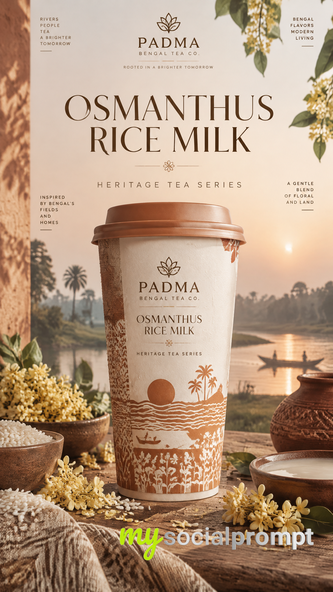
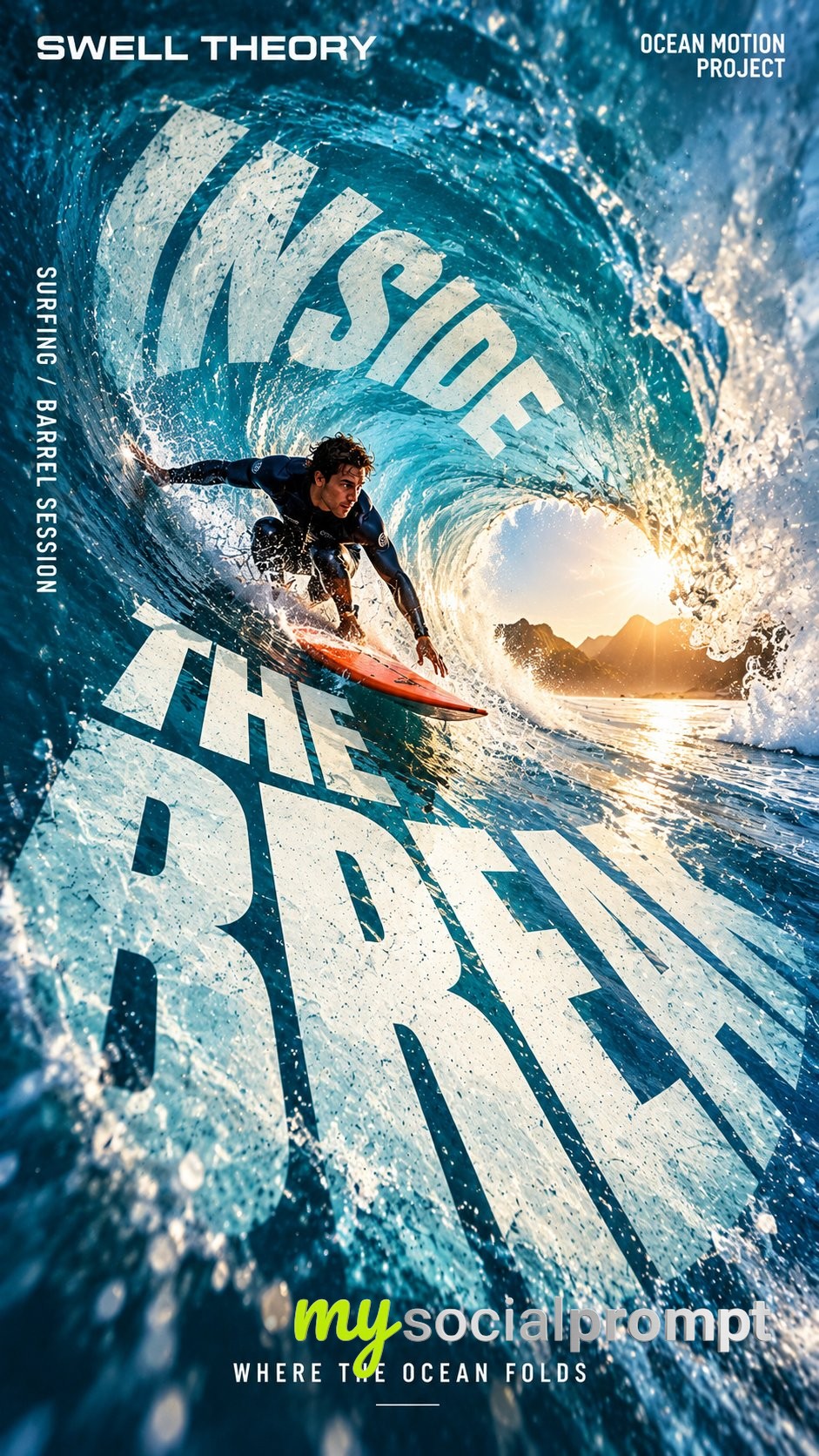
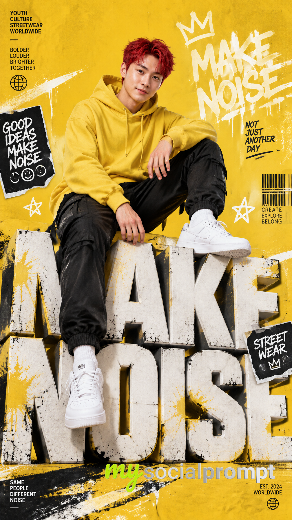
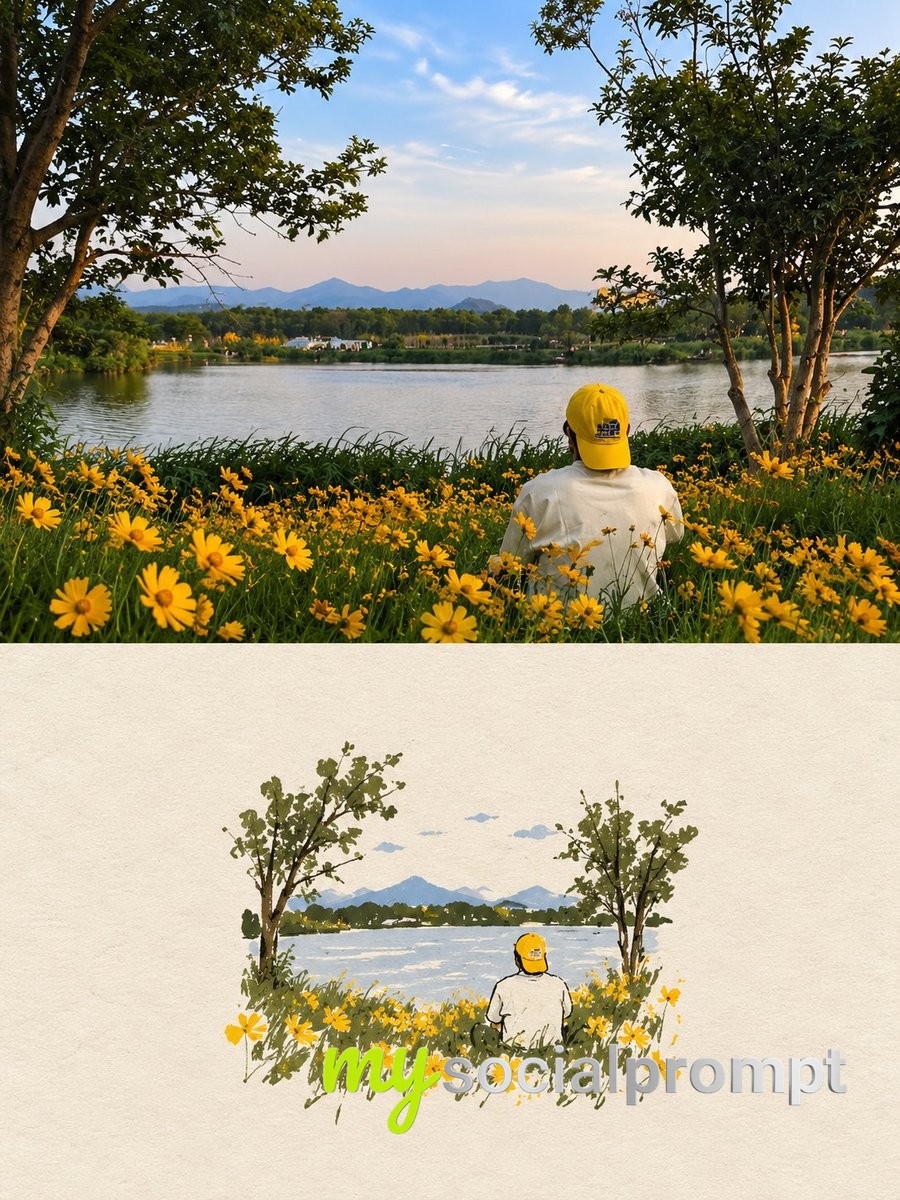
These four commercial posters feel like flipping through a luxury magazine. In each one, two massive materials press in from the left and right edges, squeezing out a bright vertical channel in the middle where a single product or figure quietly takes the stage. The slit glows like a breath of fresh air between heavy walls of texture, and the whole set radiates calm, expensive restraint.
The prompt works because it treats the negative space as the real hero. The editorial design logic is spelled out: a slow S-shaped rift that widens and tightens, keeping the center clean and airy. Large serif typography spans both materials and the gap, switching between warm white and deep black depending on the background, so the text stays legible while feeling like part of the composition. And the instruction to make one side heavier and the other lighter avoids the dead symmetry that would flatten the image.
To remix it, swap the core subject for something unexpected, like a ceramic vase or a vintage camera, and shift the palette to dusty pastels. You can also try a 4:5 aspect ratio for a more classic poster crop, or push the rift wider to give the subject more breathing room.