Weekly AI Digest
Master the AI Revolution
Exclusive prompts, model comparisons & creative techniques — curated weekly for creators and professionals who stay ahead.
No spam. Unsubscribe anytime.
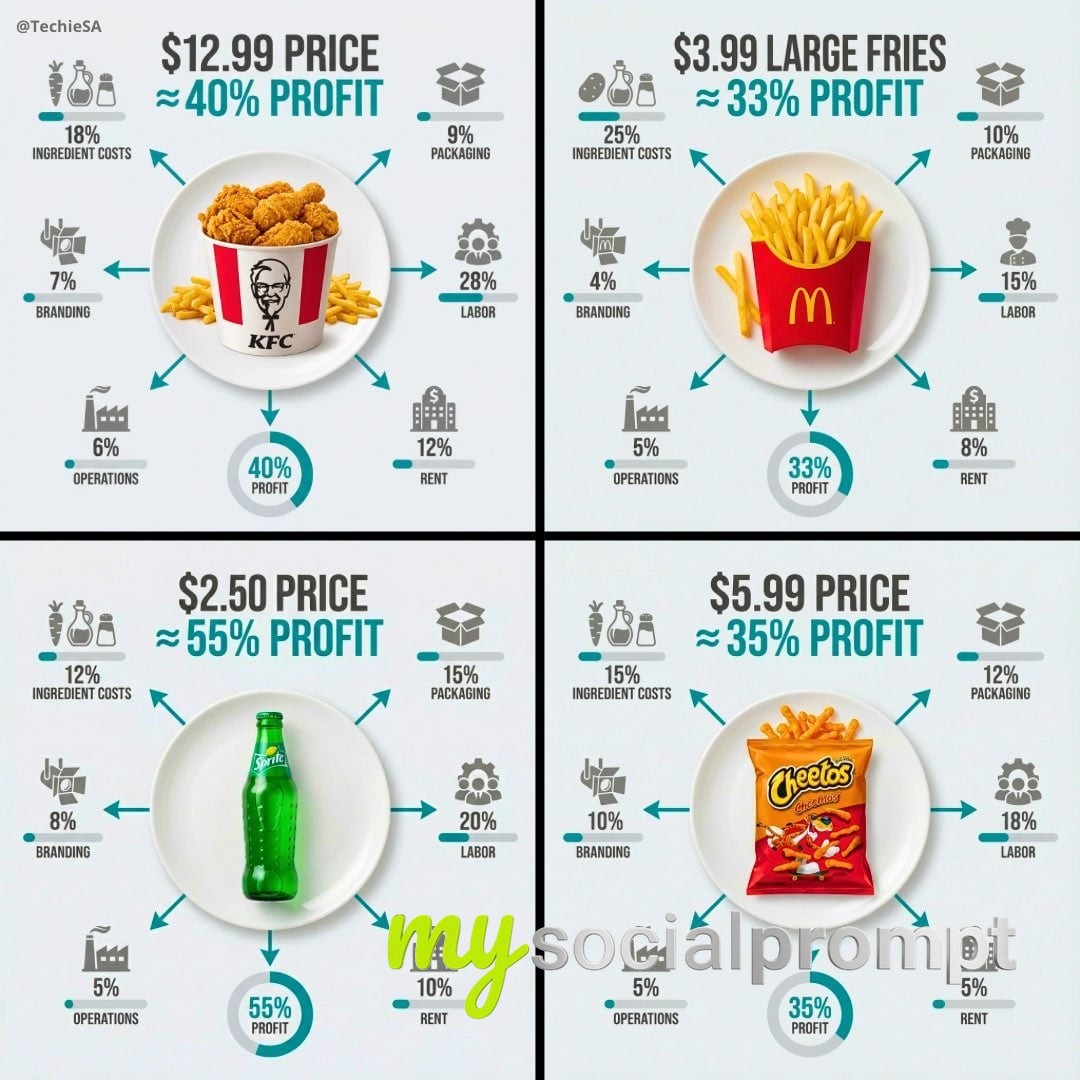
Ultra-clean top-down (90° flat lay) infographic. Centered white plate or cup on a light background with [PRODUCT] neatly presented. Surround the food with a clear money-flow infographic showing what you pay for: ingredient costs, packaging, labor, rent, branding, operations, and profit. Use icons, percentage bars, pie rings, and arrows flowing outward from the food.Large price or profit callout as the main focal point, bold sans-serif, high contrast, instantly readable.Style: premium editorial infographic, Apple UI × National Geographic, clean hierarchy, minimal text, strong visual clarity. Natural food colors, monochrome UI, one accent color for emphasis.1080×1080, ultra-crisp, no watermark.
This ultra-clean top-down infographic uses a flat lay composition to deconstruct the true cost of a menu item. A centered white plate holds the dish, while a surrounding money-flow diagram uses pie rings, percentage bars, and outward arrows to show ingredient costs, packaging, labor, rent, branding, operations, and profit. The design emulates Apple UI and National Geographic infographic standards: natural food colors, monochrome UI, and a single accent color for emphasis. A large price callout anchors the layout in bold sans-serif type. This style is ideal for food marketing design and premium brand transparency. #FoodInfographic #CostBreakdown #FlatLayDesign
Comments (0)
You must be signed in to post a comment. Comments are automatically reviewed by AI moderation.
Sign in to commentNo comments yet. Be the first to leave a comment!