artz@artz · October 30, 2026 · 0 views
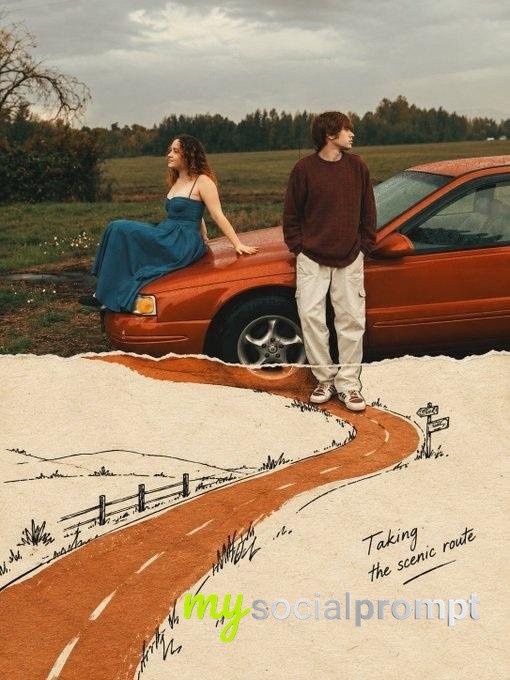
Handmade Paper Cultural Poster with Tactile Fiber Texture and Micro Scene
Theme: [Theme]
Main palette: [Main Palette]
Large paper structure: [Large Paper Structure]
Micro scene: [Micro Scene]
Title: [Title]
Event details: [Event Details]
Aspect ratio: 9:16

Create a refined vertical cultural poster using paper fiber, large color fields, and micro scenes as the core visual language.

Build the composition around a few large handmade paper forms using the selected palette. The paper should feel tactile and physical, with visible natural fibers, pulp texture, pigment absorption, subtle pressure marks, irregular edges, and gentle tonal variation. Keep the material matte, clean, sophisticated, and contemporary.

Let the large paper forms define the composition before adding any text. They may float, overlap, weave, fold, flow, connect, open, or frame negative space depending on the selected structure. Avoid regular grids and generic poster layouts. From a distance, the image should read as a strong arrangement of large color fields.

Inside or around the large paper composition, add one very small micro scene related to the theme. Include two or three adult figures naturally performing the activity, with only a few relevant tools or objects. The entire scene should occupy roughly 3% to 5% of the image, so it becomes a detail discovered after the main composition.

Use generous warm ivory negative space to keep the poster breathable. Add only one small accent color when needed.

Typography should remain restrained and secondary. Use a refined editorial serif for the main title and small uppercase sans serif for supporting information. Keep the title relatively small and place it in a quiet area of negative space. Use meaningful event information only.

The visual reading order should be:

large paper color fields first, material texture second, micro scene third, title and event information last.

The final result should feel tactile, editorial, artistic, contemporary, and carefully crafted. From a distance it should be visually simple and strong. Up close it should reveal paper fibers, subtle material details, tiny people, tools, and narrative.
A refined editorial composition built from large handmade paper forms in layered color fields, revealing visible fibers, pulp grain, and soft pigment absorption. Within the tactile structure, a tiny micro scene of figures at work becomes a discovered narrative detail. Warm ivory negative space and restrained serif typography anchor the piece, balancing minimalist composition with material texture. #PaperArt #EditorialDesign #TactilePoster #CulturalDesign
Originally shared by Larus Canus (@MrLarus) view the original